Zaum
Feed Your Seoul
Feed Your Seoul
Brief
Develop a visual identity for a restaurant concept called “Zaum.” Zaum is an experimental language concept developed by the Russian futurist poet, Aleksei Kruchenykh. The word itself a combination of the prefix “za,” meaning “beyond,” and the noun “um,” meaning “the mind” and can be translated as “transreason,” or “beyondsense.”
Concept
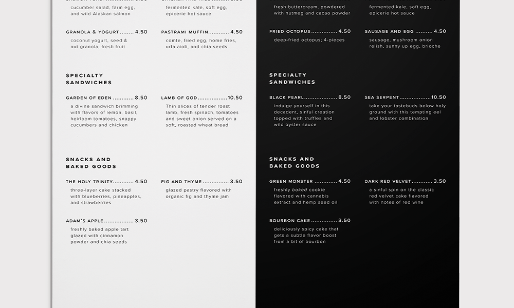
Zaum is a vices and virtues bakery in Seoul, South Korea. The idea came from Korea’s identity as a Protestant nation. Despite Korea’s religious foundation, we often judge those who fail to adhere to societal standards, resulting in high suicide rates and plastic surgery procedures. Zaum offers two sections: vices and virtues. The vices section offers unhealthy, yet tempting, options, whereas the virtues section has healthy, nutritious selections. The idea was to present the dichotomy that exists in Korean culture and to provide an honest reflection of its people—Christian by name, but not by nature.
Client..............Student project at UT Austin
Role................Designer, Art Director
Instructor.......Jason Wilkins
Field................Art Direction, Branding, Visual Identity System
Date................February 2018
Develop a visual identity for a restaurant concept called “Zaum.” Zaum is an experimental language concept developed by the Russian futurist poet, Aleksei Kruchenykh. The word itself a combination of the prefix “za,” meaning “beyond,” and the noun “um,” meaning “the mind” and can be translated as “transreason,” or “beyondsense.”
Concept
Zaum is a vices and virtues bakery in Seoul, South Korea. The idea came from Korea’s identity as a Protestant nation. Despite Korea’s religious foundation, we often judge those who fail to adhere to societal standards, resulting in high suicide rates and plastic surgery procedures. Zaum offers two sections: vices and virtues. The vices section offers unhealthy, yet tempting, options, whereas the virtues section has healthy, nutritious selections. The idea was to present the dichotomy that exists in Korean culture and to provide an honest reflection of its people—Christian by name, but not by nature.
Client..............Student project at UT Austin
Role................Designer, Art Director
Instructor.......Jason Wilkins
Field................Art Direction, Branding, Visual Identity System
Date................February 2018


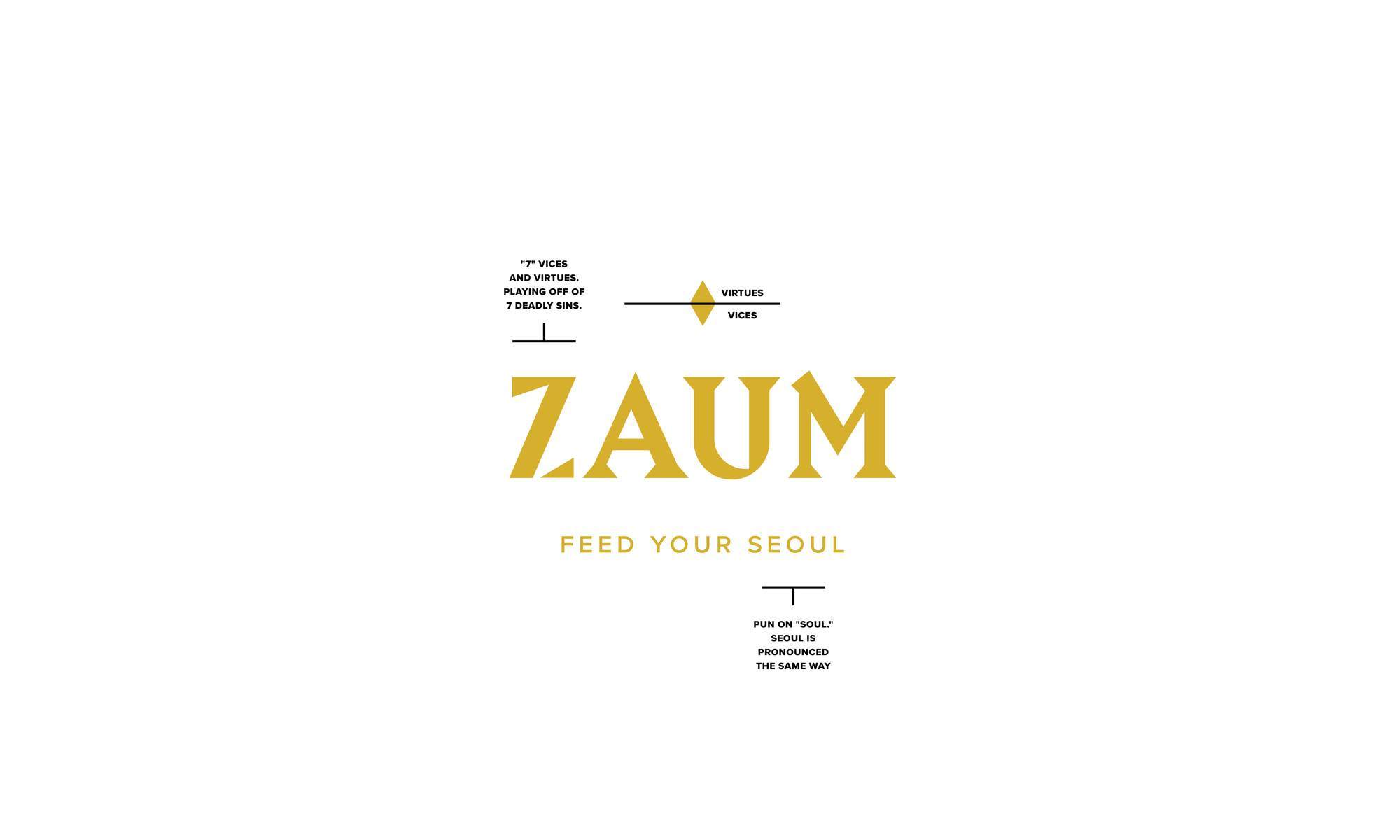
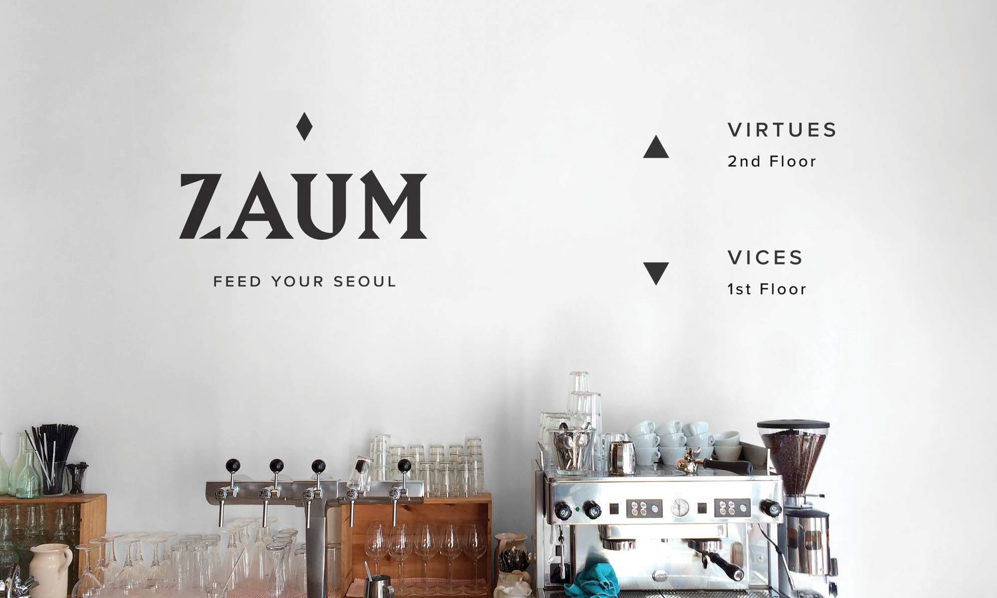
C. Vices and Virtues System
Vices (unhealthier options) are represented by a downwards triangle, whereas virtues (healthier options) are represented by an upwards triangle. The triangles come from the diamond in the main symbol.
Vices (unhealthier options) are represented by a downwards triangle, whereas virtues (healthier options) are represented by an upwards triangle. The triangles come from the diamond in the main symbol.


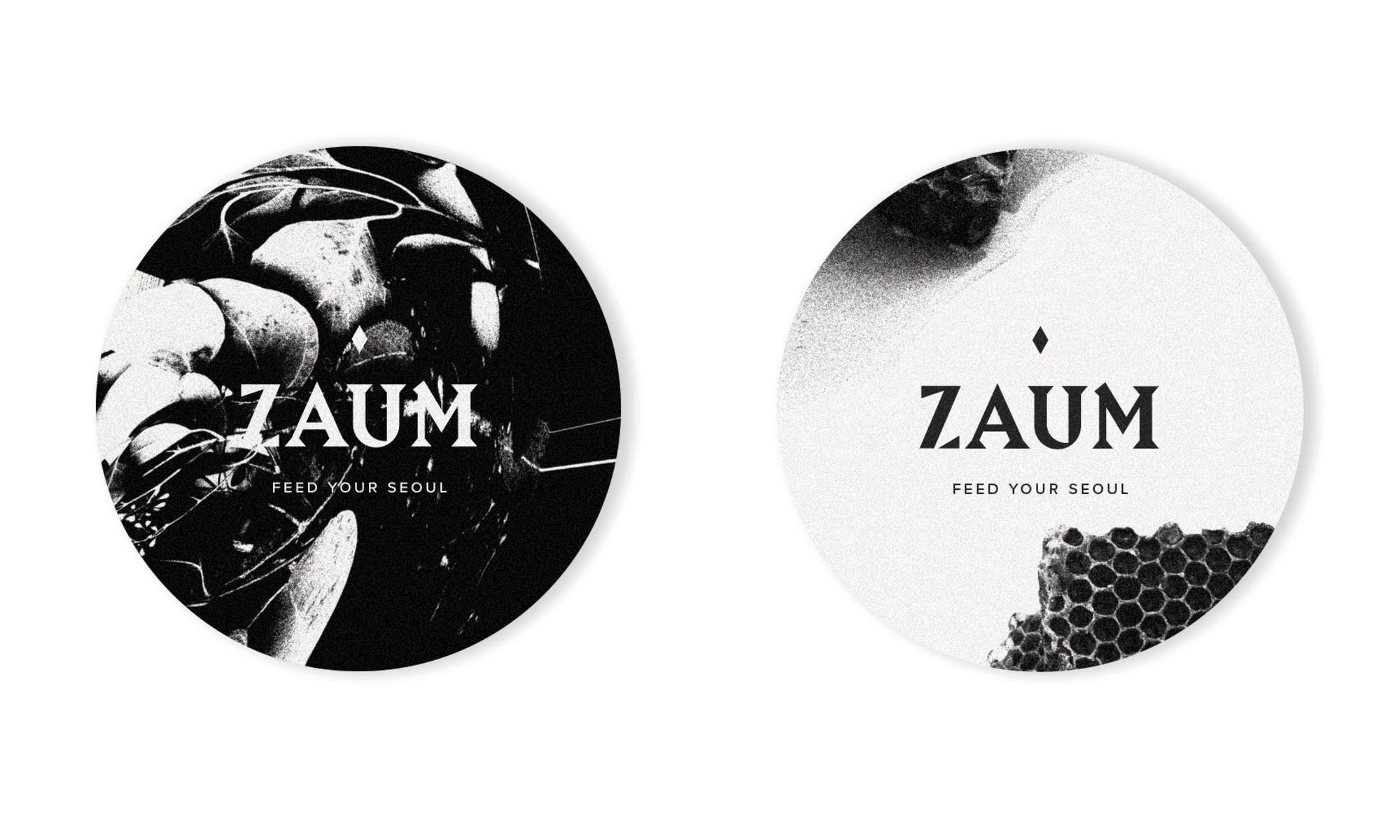
D. Neutral (not vice or virtue):
Items, such as gift cards, check presentations, and coasters, are expressed through ambiguous imagery as they don’t fall under the vice or virtue system.
Items, such as gift cards, check presentations, and coasters, are expressed through ambiguous imagery as they don’t fall under the vice or virtue system.
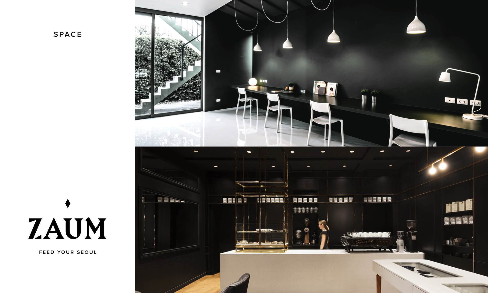
E. Space
Wayfinding and interior
Wayfinding and interior