eBay: Product Discovery Page
A fresh approach to product discovery on eBay
A fresh approach to product discovery on eBay
Problem
eBay is seen as a space for buyers who know exactly what they want, rather than a platform for browsing and discovering new items, thus limiting its potential for product exploration and inspiration.
Opportunity
By introducing a curated product discovery page, we can reposition eBay from a destination for specific shopping needs to a platform for unexpected product finds.
Role..................Design Lead, Ads/Recommendations Team
Partners...........Alyssa Danesh (Product Manager), Anas Bouzoubaa (Engineer)
Field.................Research, Prototyping, UX/UI Design, Visual Design, Design Systems
Platforms.........Android, iOS
Date..................Q4 2022-Q2 2023
A. Research and Customer Insights
We wanted to learn how our younger audiences, primarily Gen-Z and Millennials, like to find new products, or inspiration, on eBay and what they think about the platform. To do this, we partnered with our design research team, who conducted in-depth, remote interviews with 9 participants based in the U.S. The participants shared their phone screens and walked us through how they would begin browsing for an item within the eBay app. We learned the following:
We wanted to learn how our younger audiences, primarily Gen-Z and Millennials, like to find new products, or inspiration, on eBay and what they think about the platform. To do this, we partnered with our design research team, who conducted in-depth, remote interviews with 9 participants based in the U.S. The participants shared their phone screens and walked us through how they would begin browsing for an item within the eBay app. We learned the following:
A1. Buyers perceive eBay as a mission-based marketplace, not a place to be inspired
-
Participants come to eBay for specific purchases, not to be inspired.
-
Buyers come to eBay to find the best deal for what they’re looking for and leave.
A2. Buyers find eBay’s recommendations to be irrelevant to their search parameters
-
Buyers want to see items that retain their original search parameters and help them narrow in on their search.
- Buyers want to feel there’s a human touch to what’s being recommended.
A3. Buyers want photo-driven searches that they can sort and filter through
- Buyers wanted an organized grid of photos when browsing (ex. Instagram, Pinterest, Google, etc.)
- They want larger photos and grids in the layout, but need more information to engage with item
B. User Goals
Once we had our customer insights, we worked on mapping out the user goals and objectives to guide the work
B1. Buyers know how to get to a curated product discovery page from an Item Details page.
- Ex. I want to find products related to a specific item, or a specific set of items, on the Item Details page. Where can the user go to access this feature and experience?
B2. The curated product discovery page should reflect and load recommendations similar to the item the user is interested in.
- Ex. I really like this cashmere sweater. I want to see this in different styles and colors, so I can find the cashmere sweater of my dreams.
B3. As buyers scroll down the page, recommendations should get narrower and encourage conversion.
- Ex. By the time I’ve scrolled down to the bottom of this page, I want to find something that I want. In short, the more I scroll through results, the closer I should get to the item I want.
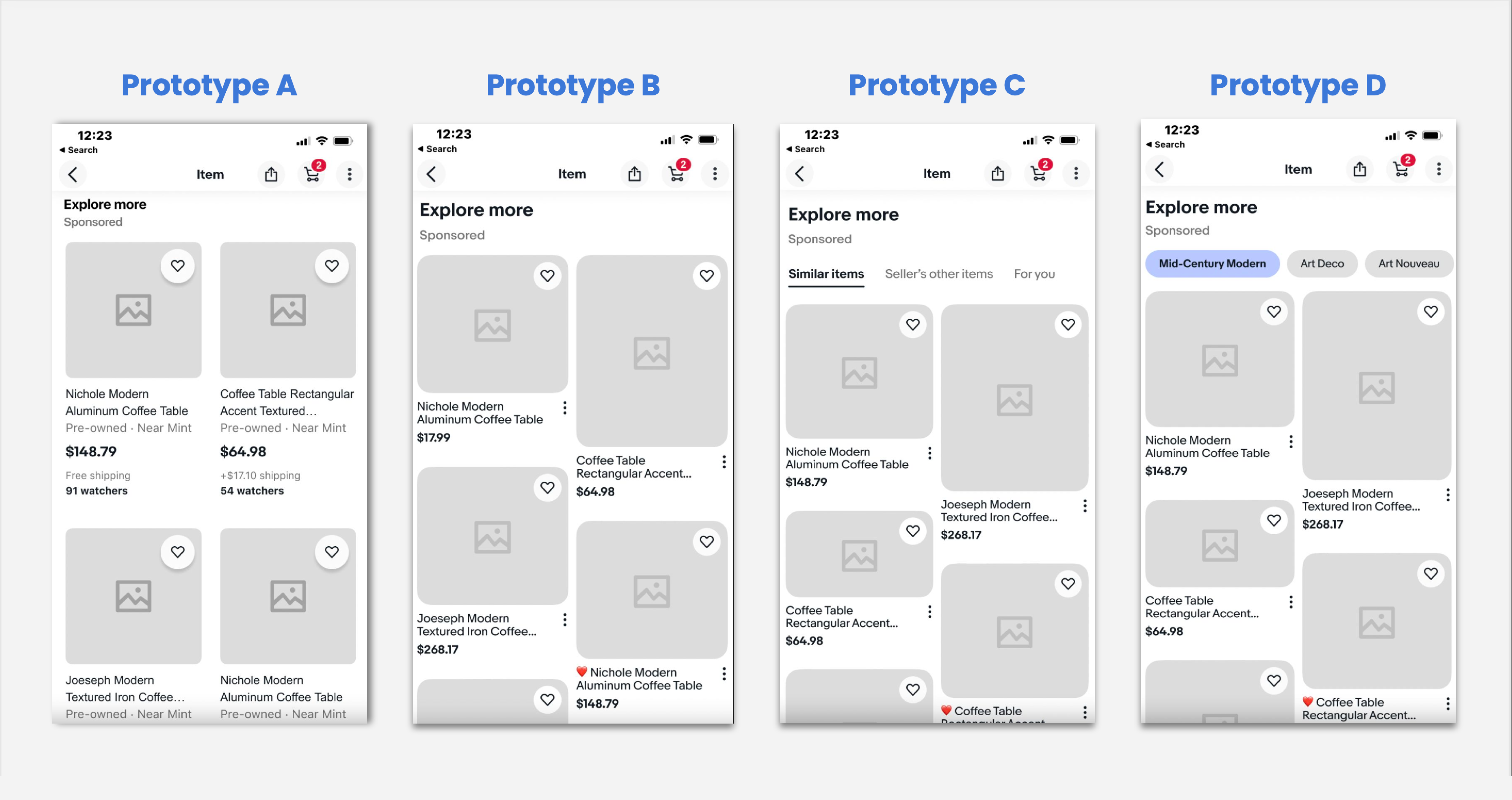
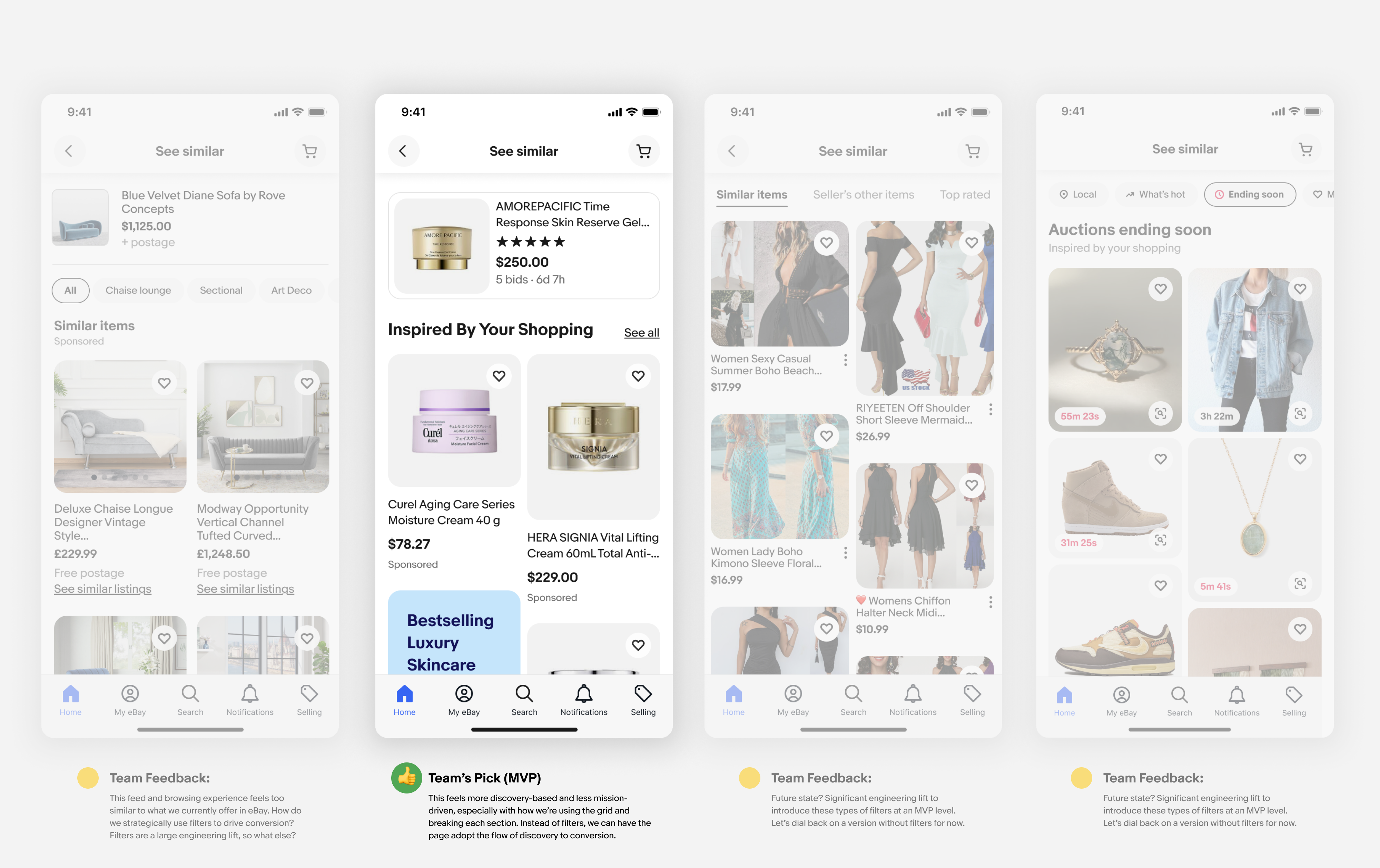
C. Design
![]()
![]()
![]()


D. Design Explorations![]()
![]()
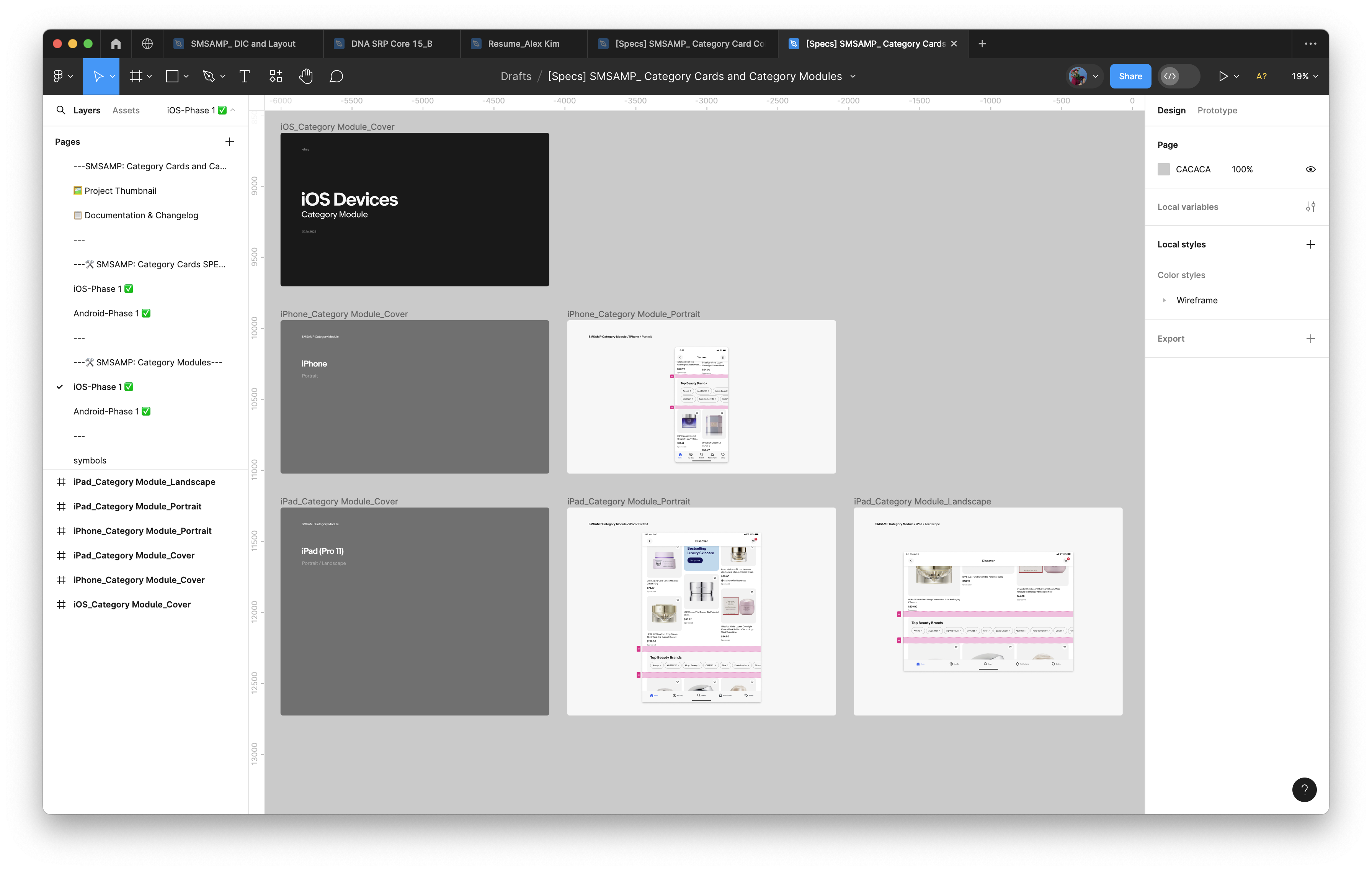
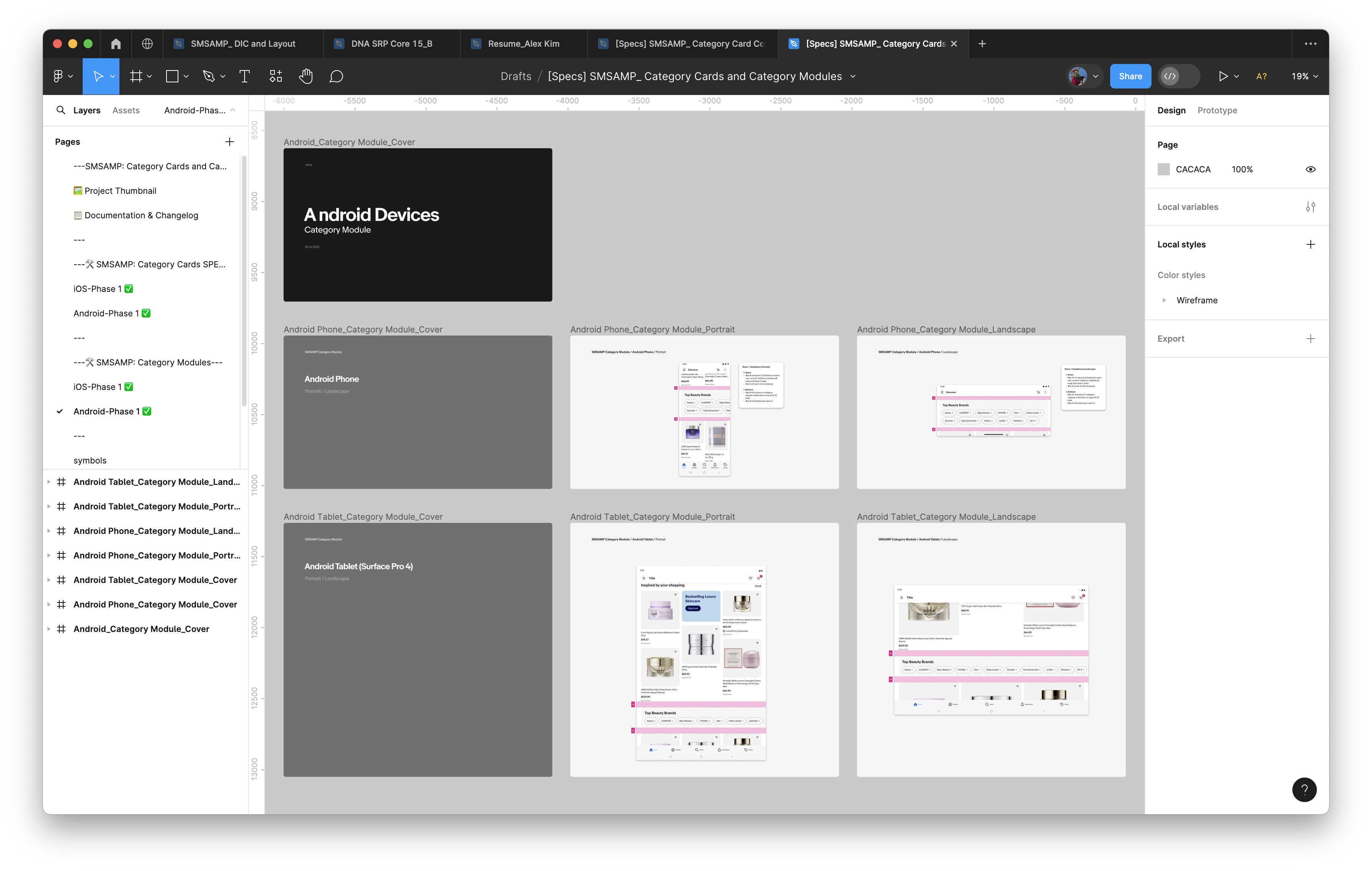
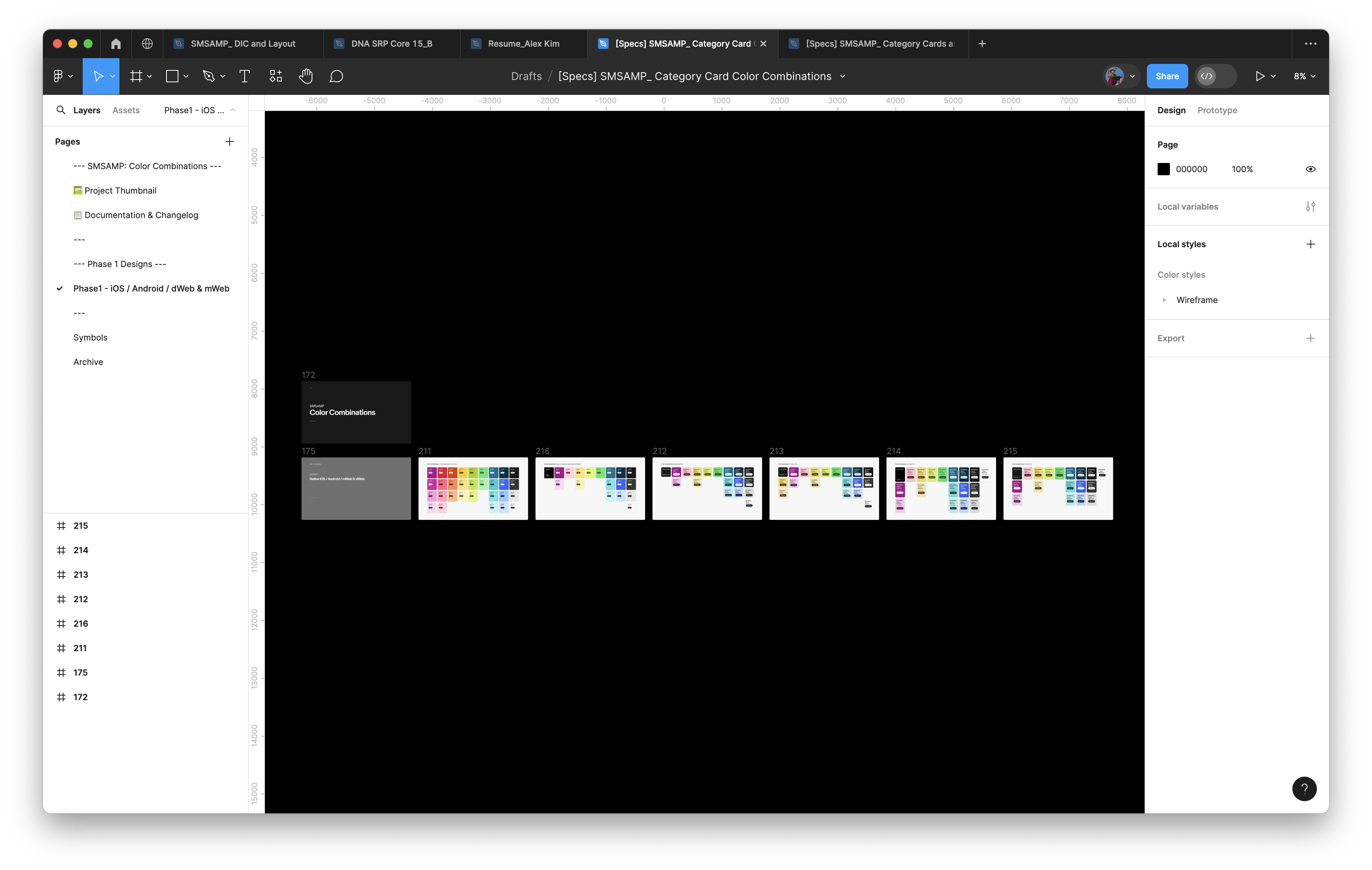
E. SPECS Handoff to Engineers
Once designs were approved by the Ads Design Leadership team, we would work on a separate SPECS file to hand off to the engineering team, so that they can commence build.
Once designs were approved by the Ads Design Leadership team, we would work on a separate SPECS file to hand off to the engineering team, so that they can commence build.

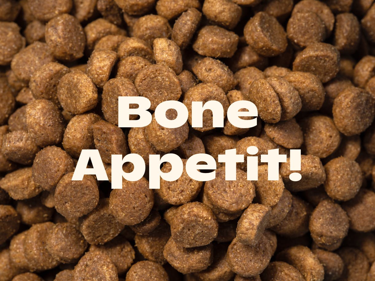
Tailored
Rethinking the future of dog food
Rethinking the future of dog food
Brief
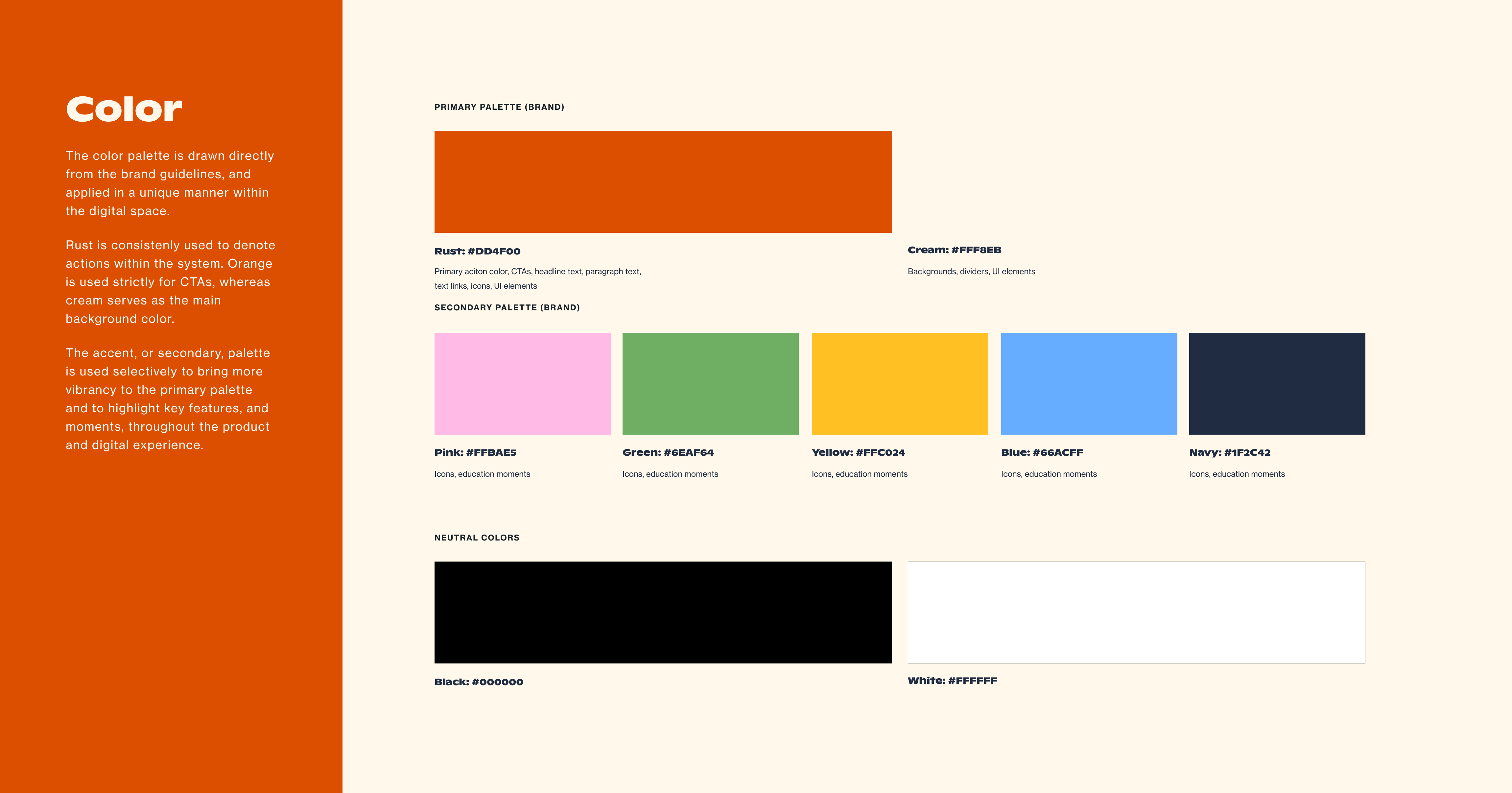
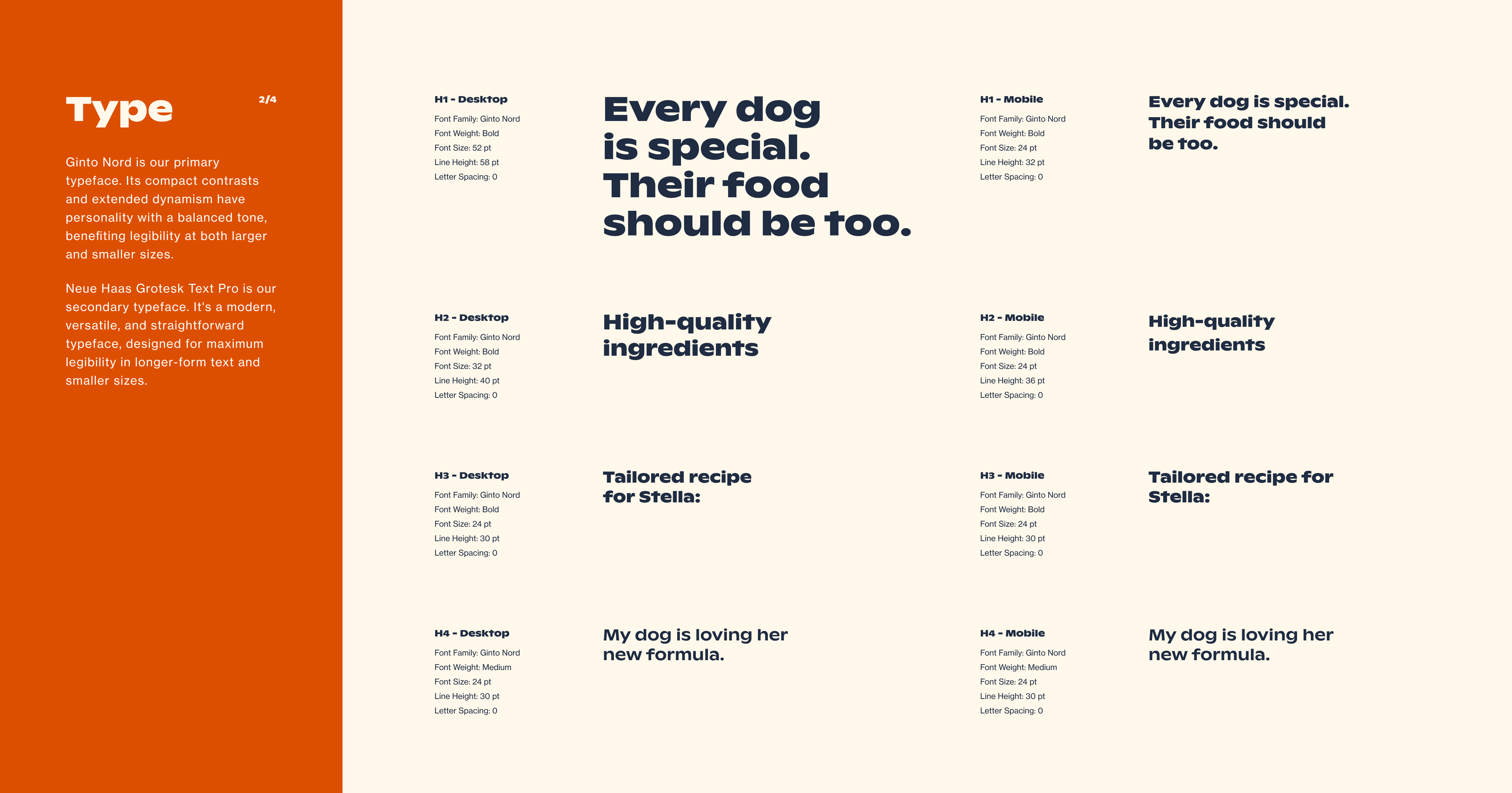
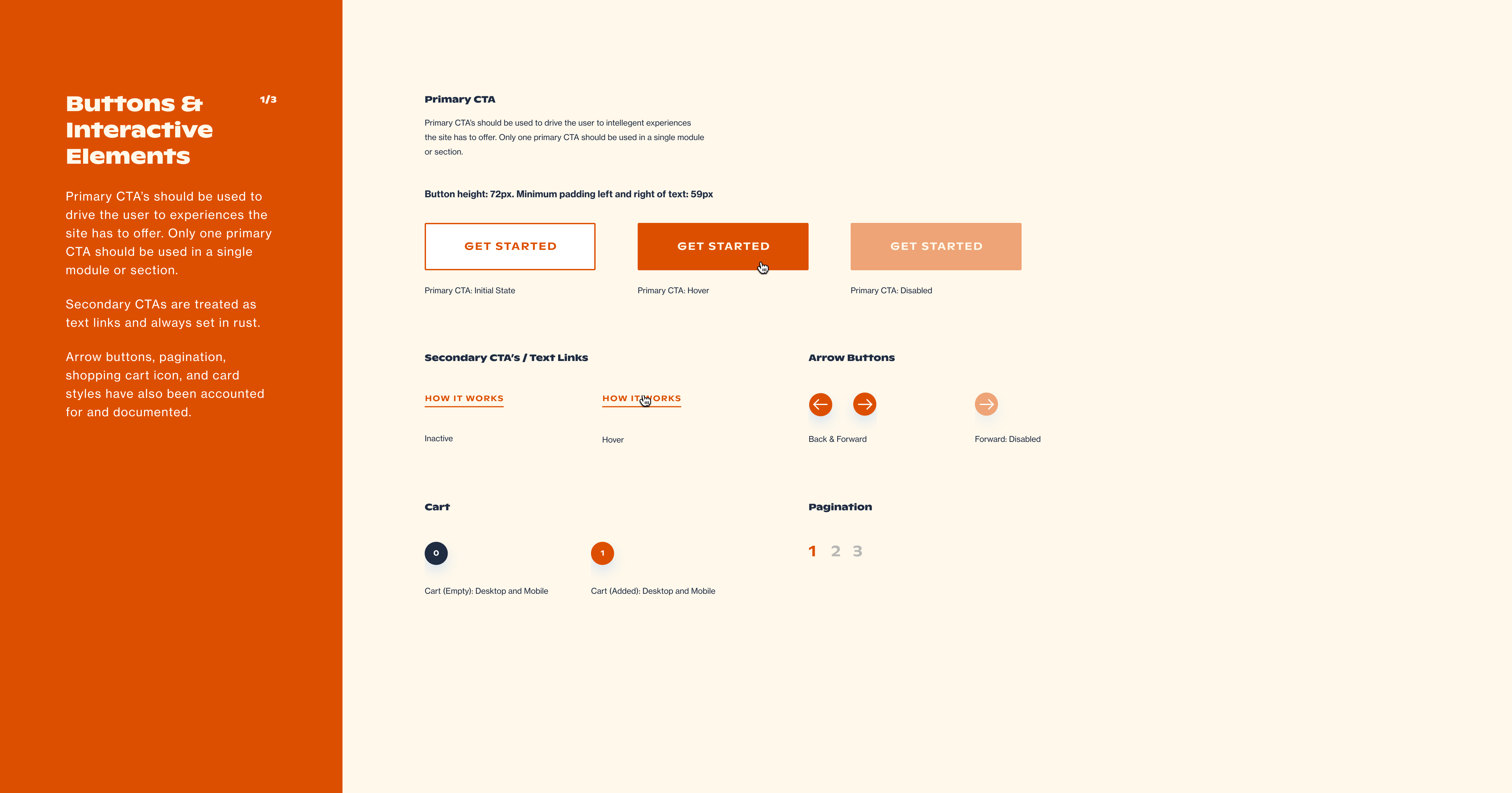
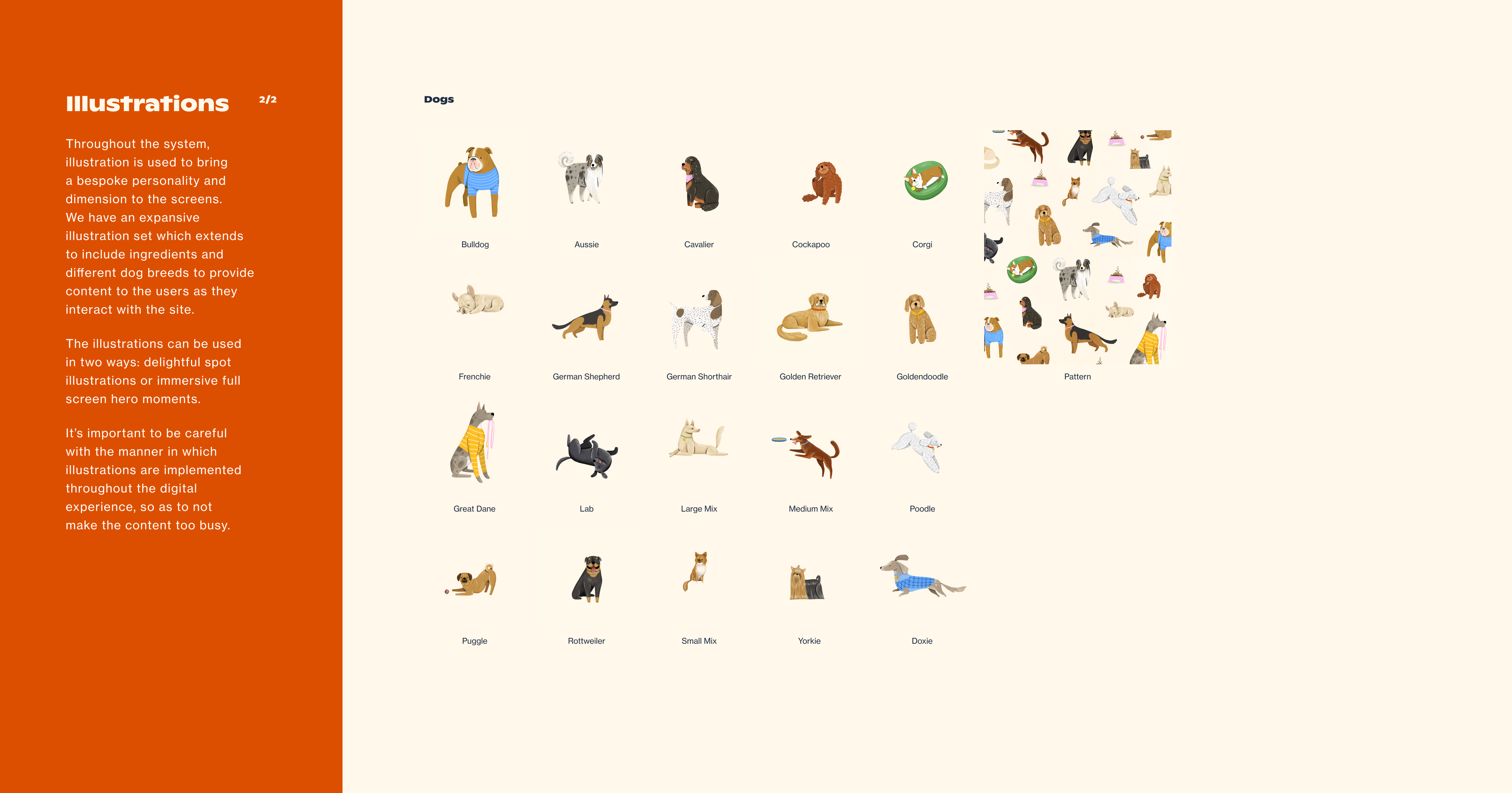
When it comes to choosing dog food, pet parents are often forced into a one-size-fits-all option. And with so many different formulas and health claims, it's hard to know what's actually helping our furry friends. The team of specialists at Tailored were determined to take the guesswork out of dog food and created a personalized, science-based solution using ingredients that tie back to specific benefits for your pup.
Solution
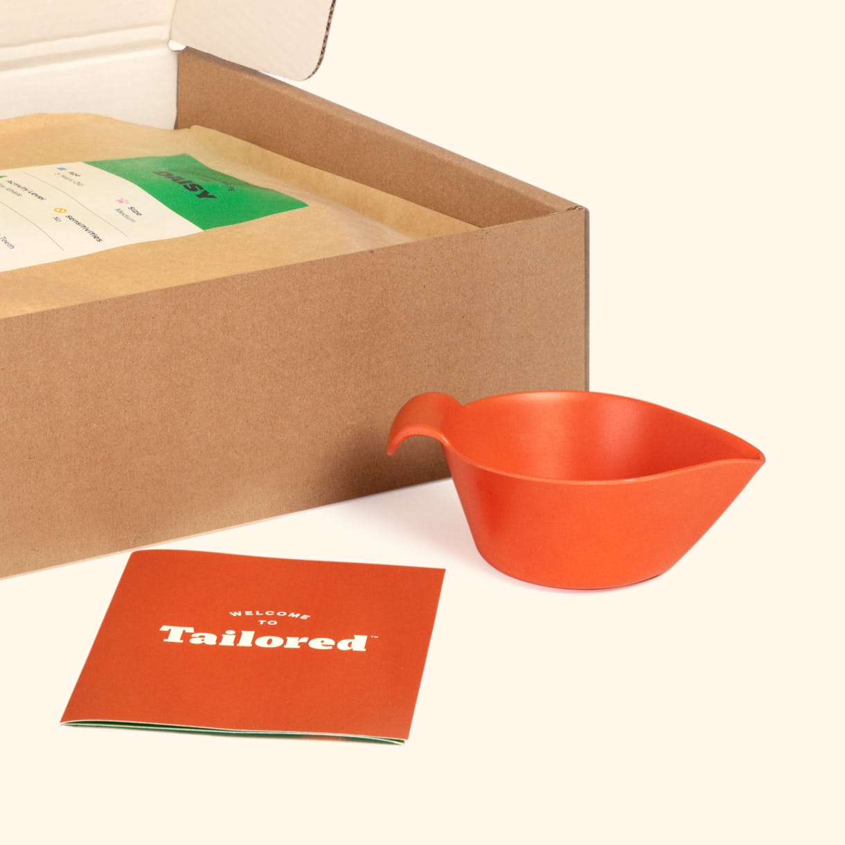
We set out to build a brand that embodies the utmost dedication to dogs. With a vibrant identity, Tailored brings a lively and enthusiastic brand system to fruition through imaginative illustrations, impactful typography, customized artisan packaging, and an engaging digital interface. As part of this brand experience, we developed a quiz that generates personalized dog kibble based on users' responses, providing a tailored and unique feeding solution for each dog.
Client.................Tailored Pet
Agency..............Red Antler
Role...................Digital Designer
Team.................Maria Bonello (UX Director), Devry Drosky, Aisling Flynn (Brand Design), Rachel Moon (Strategist), Toni Clarke (Digital Designer)
Field..................Design Systems, UX/UI Design
Date...................October-December 2019
When it comes to choosing dog food, pet parents are often forced into a one-size-fits-all option. And with so many different formulas and health claims, it's hard to know what's actually helping our furry friends. The team of specialists at Tailored were determined to take the guesswork out of dog food and created a personalized, science-based solution using ingredients that tie back to specific benefits for your pup.
Solution
We set out to build a brand that embodies the utmost dedication to dogs. With a vibrant identity, Tailored brings a lively and enthusiastic brand system to fruition through imaginative illustrations, impactful typography, customized artisan packaging, and an engaging digital interface. As part of this brand experience, we developed a quiz that generates personalized dog kibble based on users' responses, providing a tailored and unique feeding solution for each dog.
Client.................Tailored Pet
Agency..............Red Antler
Role...................Digital Designer
Team.................Maria Bonello (UX Director), Devry Drosky, Aisling Flynn (Brand Design), Rachel Moon (Strategist), Toni Clarke (Digital Designer)
Field..................Design Systems, UX/UI Design
Date...................October-December 2019


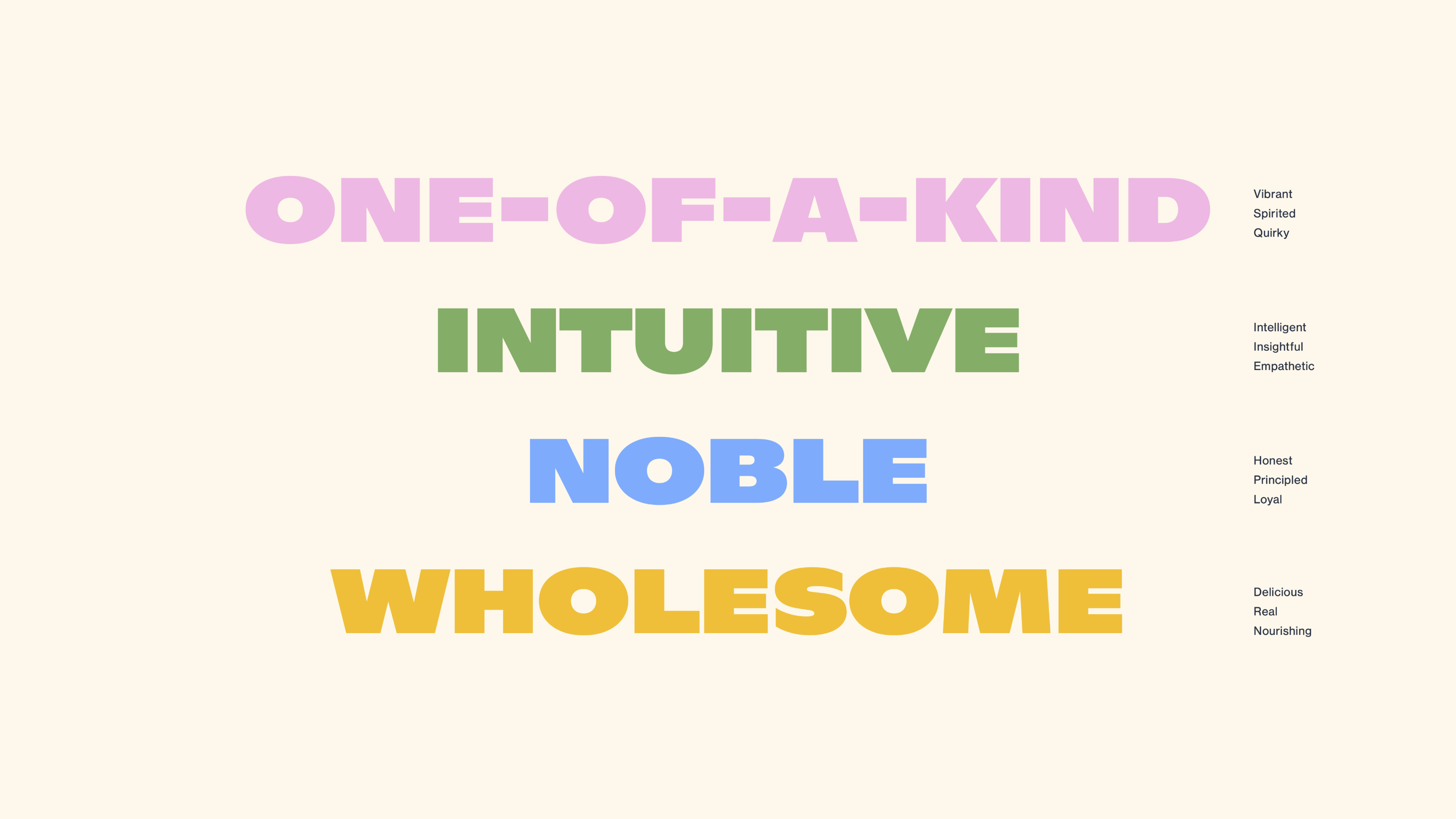
A. Tone of Voice
B. Design Library
We built a comprehensive digital design system that includes guidelines for components and patterns. This design system serves as a toolkit for our client to effectively express their digital identity.
We built a comprehensive digital design system that includes guidelines for components and patterns. This design system serves as a toolkit for our client to effectively express their digital identity.


C. Sitemapping + Wireframing
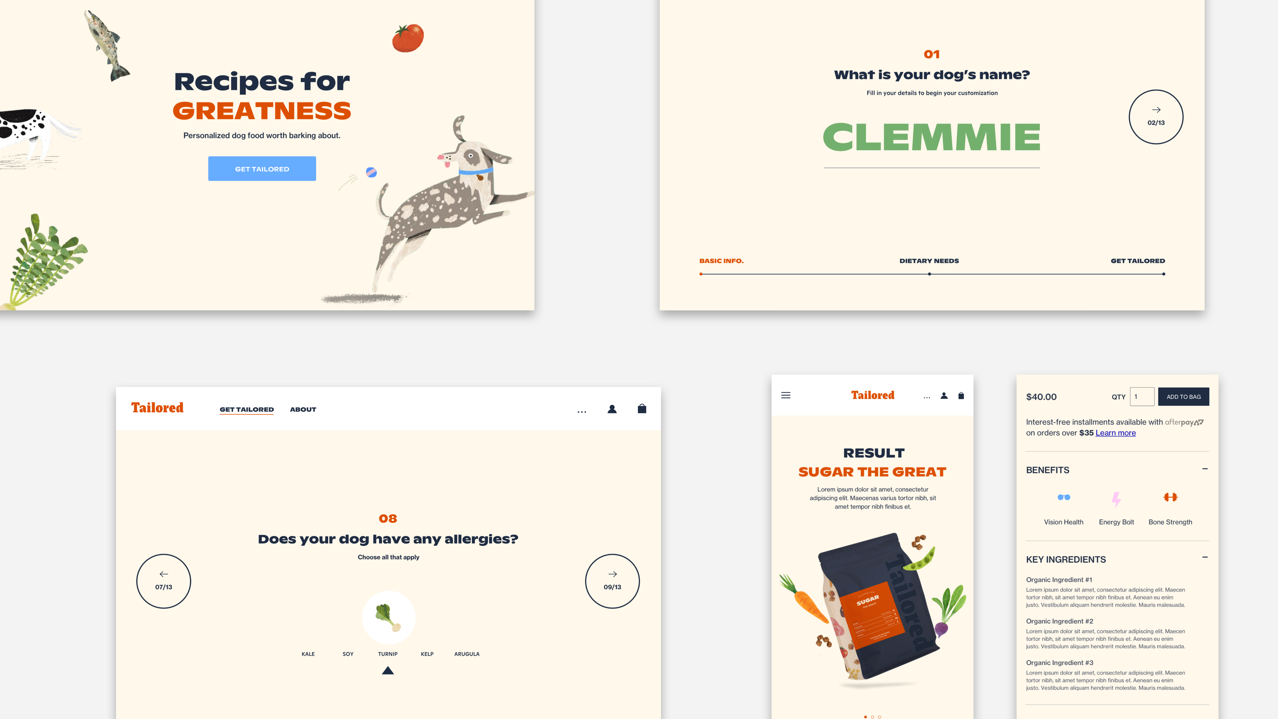
Our client needed an e-commerce platform to sell their product and communicate their identity and values as a brand. A key interactive feature was a quiz, allowing customers to create custom profiles for their dogs. This information was then used to produce a bespoke kibble blend tailored to individual pet needs.
![]()
![]()
Our client needed an e-commerce platform to sell their product and communicate their identity and values as a brand. A key interactive feature was a quiz, allowing customers to create custom profiles for their dogs. This information was then used to produce a bespoke kibble blend tailored to individual pet needs.


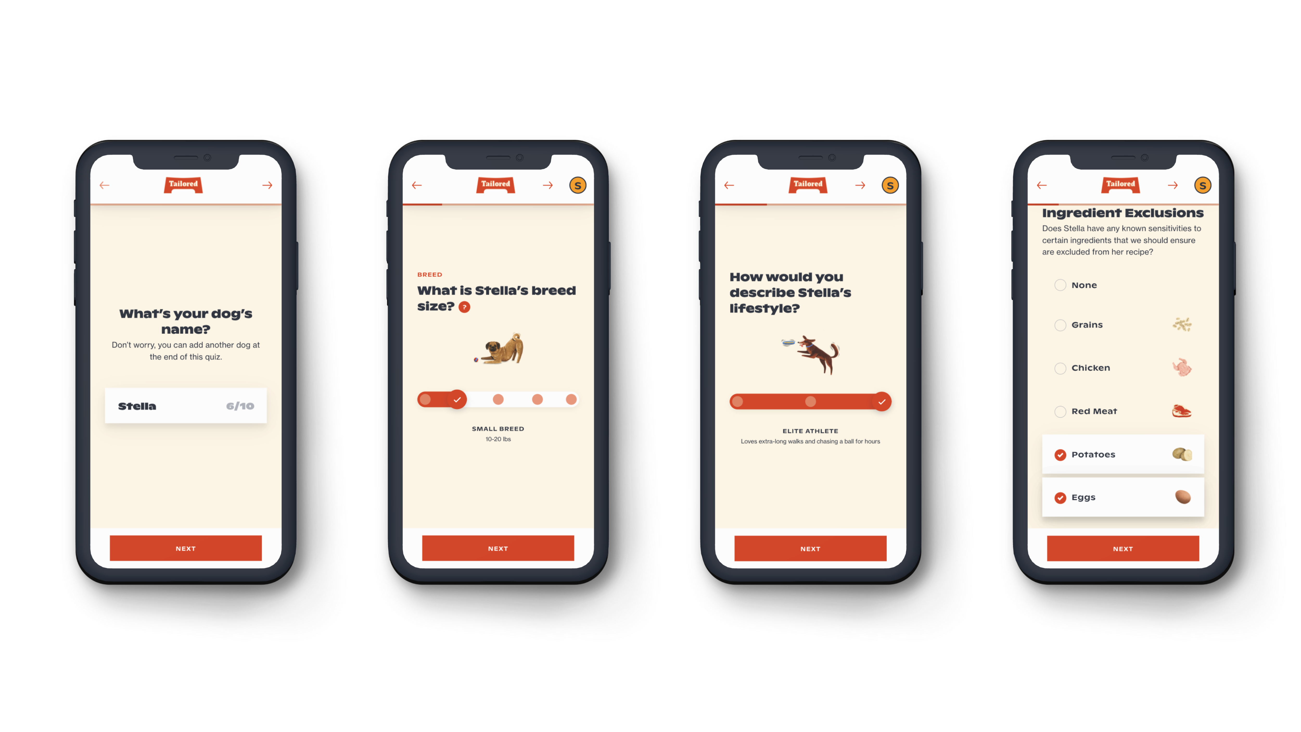
D. Main Touchpoint: “Tailored Quiz”
One of the main touchpoints for the client's site was to provide users with a quiz that generates personalized dog kibble based on their responses.
![]()
![]()
One of the main touchpoints for the client's site was to provide users with a quiz that generates personalized dog kibble based on their responses.

E. Explorations: Tailored Quiz
![]()
F. Outcomes
Tailored successfully launched at the beginning of 2020 to favorable reviews. The site received positive feedback for its fast and efficient process and easy navigation.
Tailored successfully launched at the beginning of 2020 to favorable reviews. The site received positive feedback for its fast and efficient process and easy navigation.


Fellow
Rethinking the future of male fertility treatments
Rethinking the future of male fertility treatments
Brief
Fellow aims to revolutionize fertility testing by offering an at-home, mail-in kit that makes the process more accessible. We understand that conversations around fertility can be awkward or intimidating, so our goal was to create a digital experience that communicates confidence, trust, and ease.
Solution
When it came to designing the site, our main goal was to create an experience where users would feel empowered, in control, and at ease while navigating through the digital platform. We wanted to establish trust and confidence by prominently showcasing the fertility kit, the company's scientific foundation, and a comprehensive blog featuring resources and conversations on male fertility. By providing these touchpoints, we aimed to enable users to take charge of their own journey. With Fellow, we aimed to eliminate the discomfort of awkward discussions and the barriers of inaccessibility that may have existed in the past.
Client.................Fellow
Agency..............Red Antler
Role...................Digital Designer
Team.................Saul Fougnier (Design Director), Liz Juusola (Strategy Director), Dan Crawford, Dan Zafian (Brand Design), Gus Esselstyn (Strategist)
Field..................Design Systems, UX/UI Design
Date...................August-October 2019


A. Tone of voice
![]()
![]()


B. Design Library ![]()


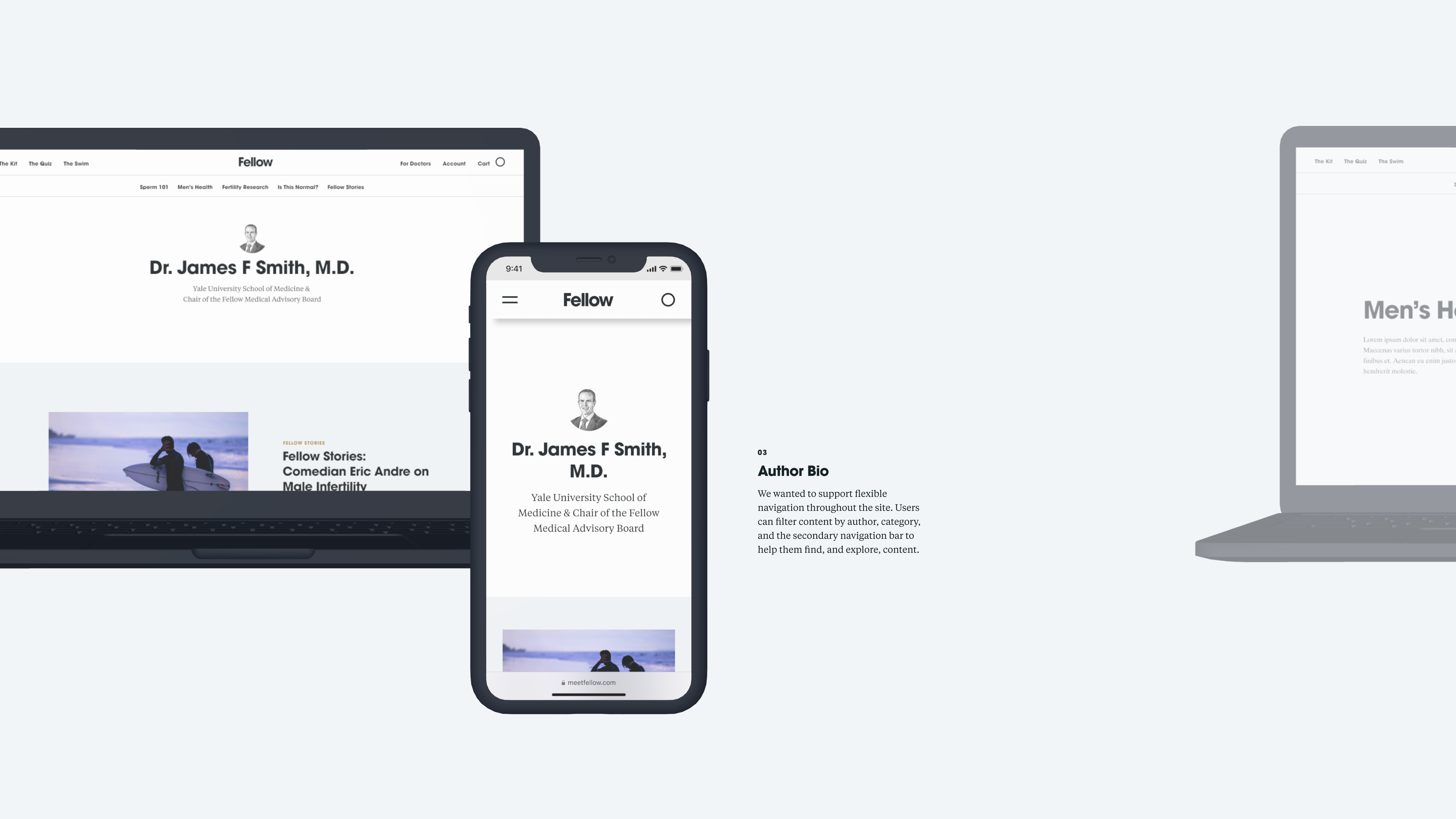
C. Main Touchpoint: “The Swim,” Fellow Blogsite
![]()
![]()
![]()
![]()


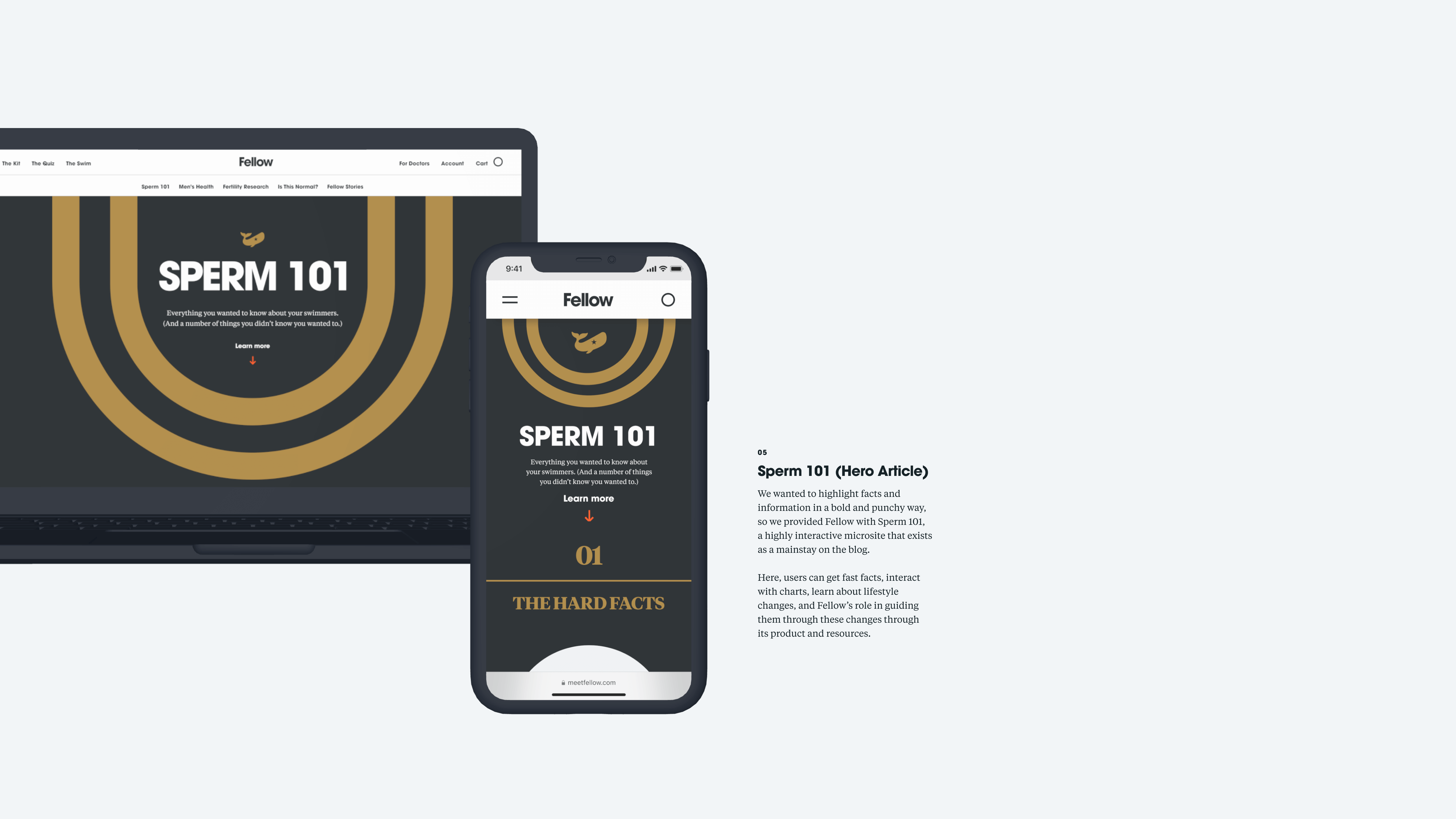
D. Main Touchpoint: “Sperm 101,” Fellow Blogsite’s Hero Article
![]()
![]()


E. Explorations


F. Outcomes Fellow successfully launched at the beginning of 2020 to favorable reviews. The site received positive feedback for its fast and efficient process and easy navigation.


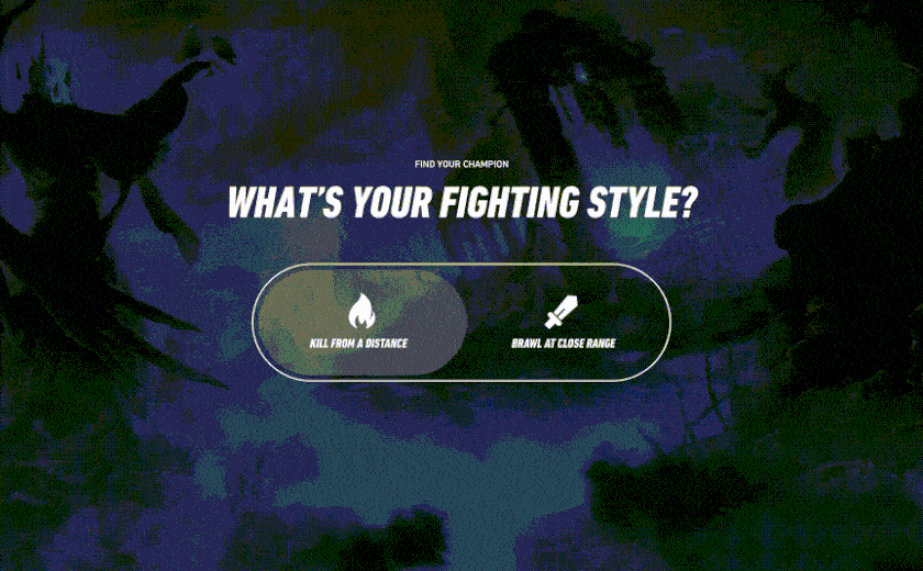
League of Legends
New Player Platform: Champion Finder Tool
New Player Platform: Champion Finder Tool
Brief
Riot Games approached Work & Co in 2018 to create an updated brand system for its game, League of Legends. The client was looking to refresh its current gaming platform while coming up with ways to recruit and retain new players through its digital platform.
We worked closely with our client to come up with concepts designed to improve the new player journey. We came up with several touchpoints to increase user engagement, such as The Champion Pass and Champion Finder Tool.
For more details, please contact me for the Keynote presentation!
Client.................Riot Games, League of Legends
Agency..............Work & Co.
Role...................Design Intern
Team..................Jon Jackson (Partner), Juliana Gaiba and Leandro Brasil (Design Leads)
Field...................User Research, UX/UI Design, Prototyping, Design Systems
Date...................June-August 2018
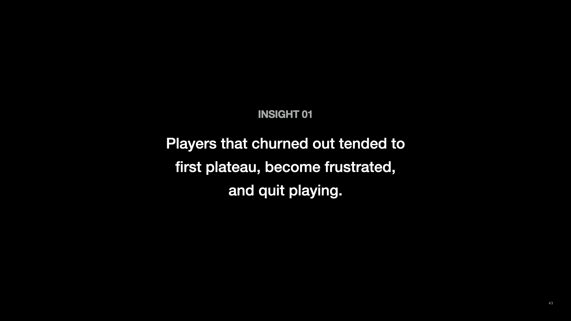
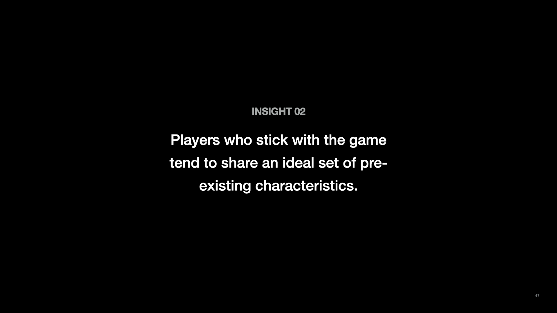
A. Research
I worked closely with the UX Design Lead, Juliana, in researching player experiences and identifying key issues. We gathered three major insights from our user interviews, which were instrumental in informing the creation of our touchpoints, such as the Champion Finder Tool:
I worked closely with the UX Design Lead, Juliana, in researching player experiences and identifying key issues. We gathered three major insights from our user interviews, which were instrumental in informing the creation of our touchpoints, such as the Champion Finder Tool:
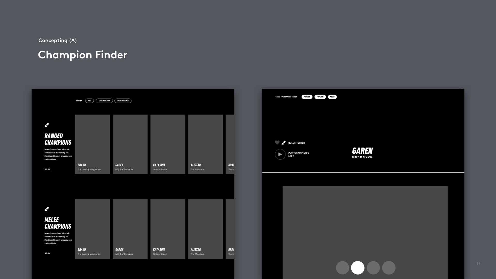
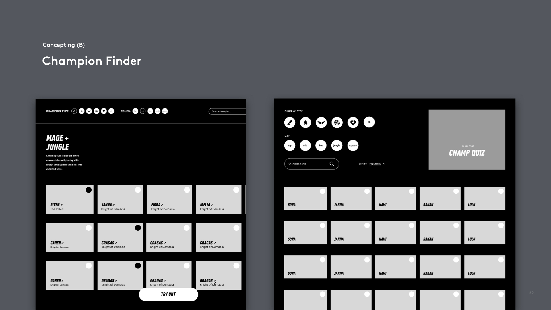
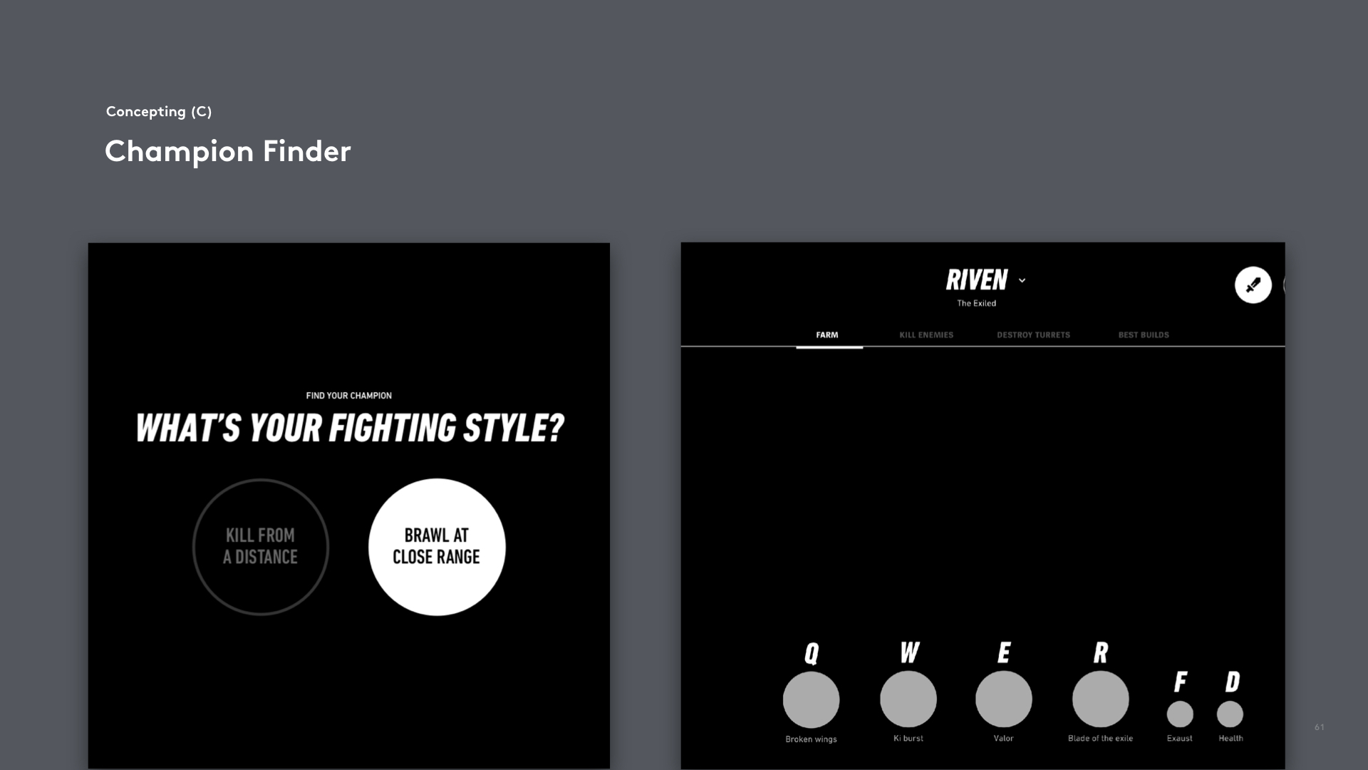
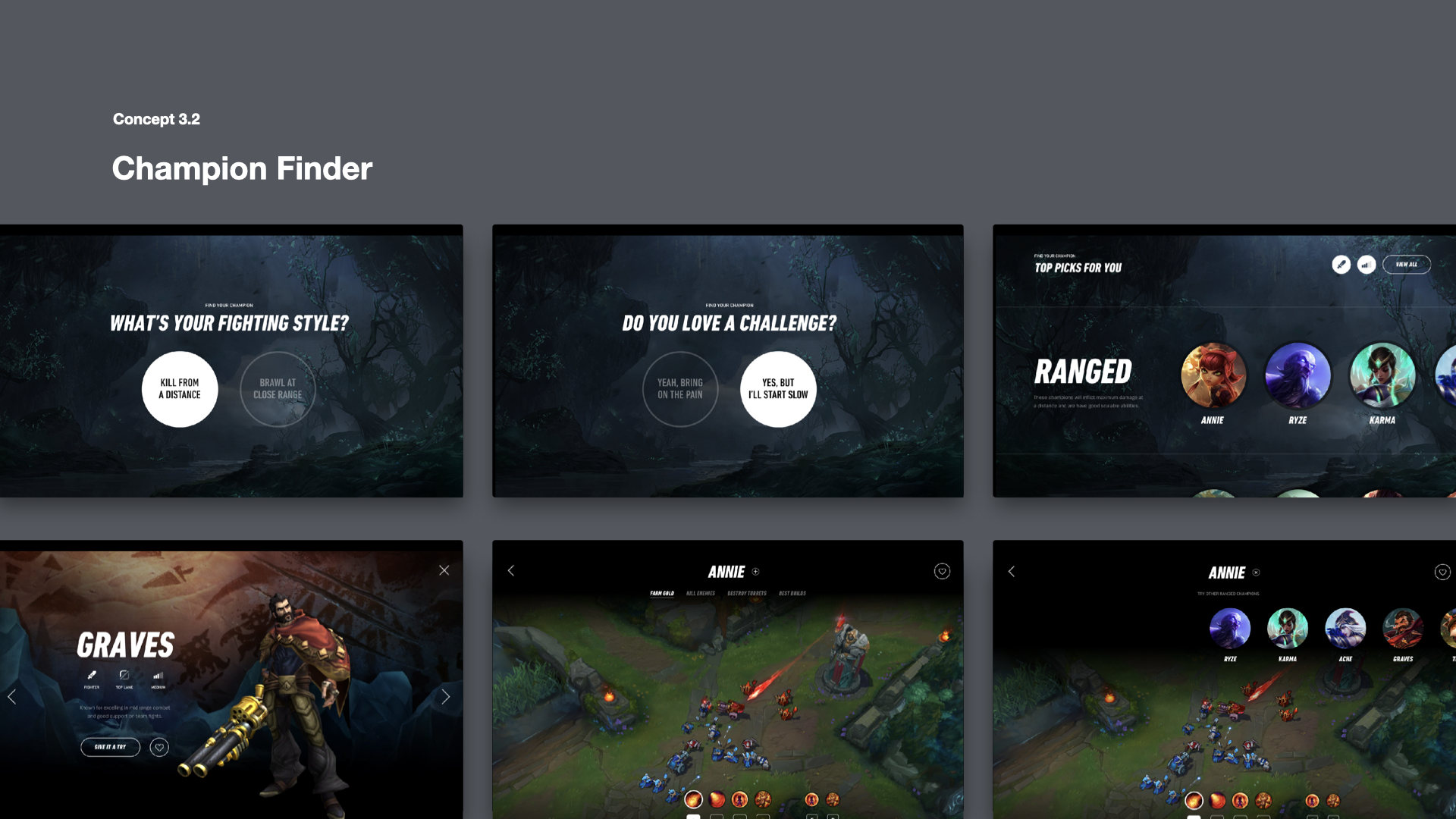
B. Champion Finder Tool (Early Prototypes)
Once we identified key issues and gained an understanding of our new players and their learning and playing approaches, Juliana and I collaborated to develop three different strategies for organizing information for The Champion Finder.
Once we identified key issues and gained an understanding of our new players and their learning and playing approaches, Juliana and I collaborated to develop three different strategies for organizing information for The Champion Finder.
C. Champion Finder (Detailed Prototypes)We teamed up with Led, our Visual Design Lead, to build The Champion Finder Tool prototype. Led was crucial in creating the League of Legends' design system and the prototype's development. His rebrand efforts allowed us to turn our sketches into the successful Champion Finder Tool, resulting in four improved versions.


D. Results and Outcomes
The Champion Finder Tool, launched on both the desktop platform and website, has greatly assisted new League of Legends players. It simplifies champion exploration, enhancing user engagement and progression. Its evolved version continues to guide players and can be accessed at https://findyourchampion.wildrift.leagueoflegends.com/en-us/.
The Champion Finder Tool, launched on both the desktop platform and website, has greatly assisted new League of Legends players. It simplifies champion exploration, enhancing user engagement and progression. Its evolved version continues to guide players and can be accessed at https://findyourchampion.wildrift.leagueoflegends.com/en-us/.

Marriott Rewards App
Making Marriott the leader for travel experiences.
Making Marriott the leader for travel experiences.
Brief
Using a guest-first approach, Work & Co. partnered with Marriott to identify and prototype opportunities for enhancing the customer journey for its loyalty rewards program, helping Marriott cement itself as a leader in travel experiences.
Client.................Marriott
Agency...............Work & Co.
Role....................Design Intern
Team..................Diego Zambrano (Partner), Dooeol Lee (Design Lead)
Field...................User Research, UX/UI Design, Design Systems
Date...................June-August 2018
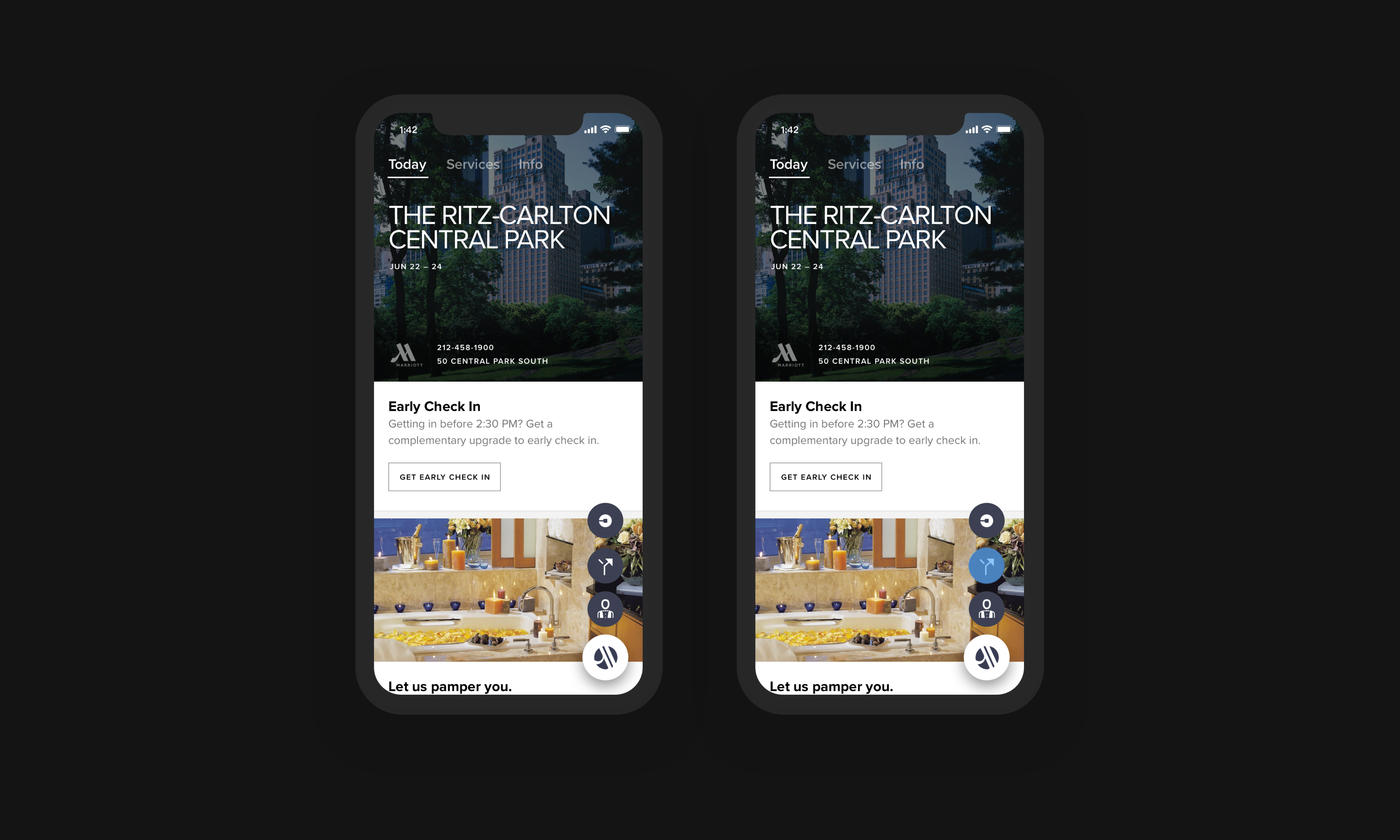
A. Pre-Arrival


C. Upgrade Features

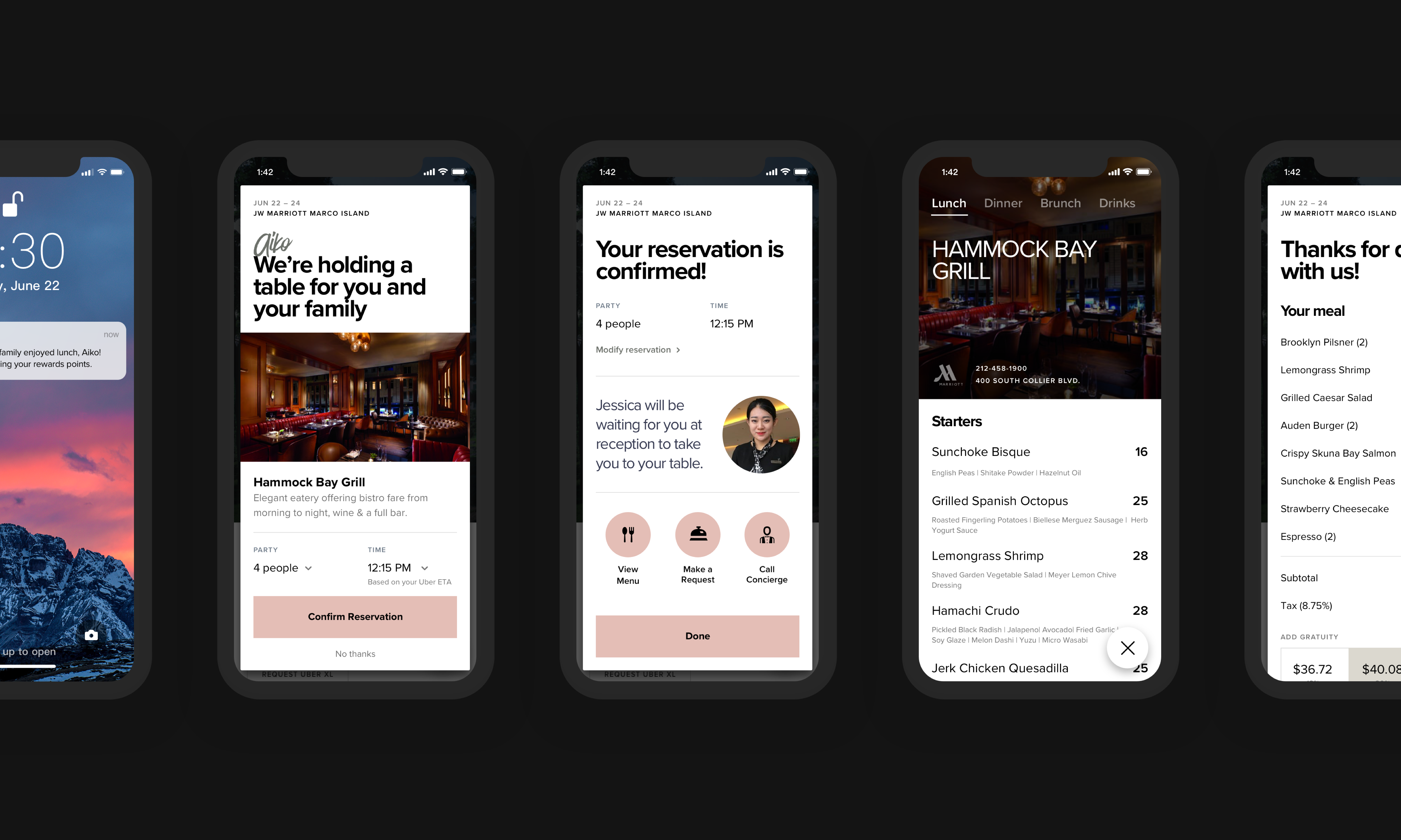
D. Restaurant/Bar Reservations